Restoration Hardware has long been one of my favourite brands. For many years, I've watched their evolution and refinement into a nationwide selection of shops that can now command up to 70,000 square feet of luxurious retail space. Toronto is fortunate to now have a RH Gallery right inside our premiere shopping centre, Yorkdale Mall.
Their pieces are without question beautiful, but sometimes, they're not always in the budget and you have to get creative.
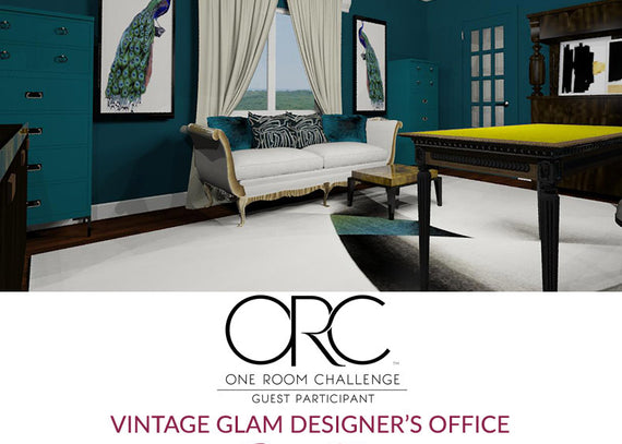
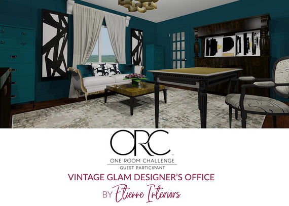
I am currently participating in the 6 week One Room Challenge. The challenge is now a bi-annual nationwide event that House Beautiful has partnered with ORC to follow 20 featured designers as well as guest participants like me! For the challenge, I have designed a "Vintage Glam Designer's Office" for my use at home. If you would like to checkout my plans, take a look at my post from Week 1.
I have this large credenza in what will be my new home office. It provides a lot of storage and I love it's straight lines and simple modern design. However, it could use some extra detail to make it more interesting and fit in with my new design.

I found inspiration from the Marlow Sideboard offered by RH Modern. What I love about the sideboard is the burnished brass banding around the perimeter of the piece. This will be an easy detail to add to my credenza, and will certainly elevate its look.

I wanted a thin band to follow the perimeter of the credenza with a thickness of 1/8" on the sides. This would give the appearance that the brass is actually a solid banding added to the front. If I just painted the face without the depth, I don't think it would be as convincing.


If you've ever tried to keep a consistent thin line using tape, you know that you always start out well and somehow end up wider or thinner at the other end. Because my piece was so dark, no pencil or marker was visible. So I made up a card and folded it over 1/8". By sliding it down the piece while taping, I was able to get a nice consistent line all the way around and on the inside edges as well.
I would have been simplest to use a beautiful brass toned spray paint to get this job done quickly, but there was no moving this piece outside to do so, way to heavy. So I needed to come up with a solution that I could do inside my home without gassing everyone out with paint fumes.
I decided on a metallic was which can be applied over just about anything. Its by Craftsmart and I picked it up at Michael's for $10. I had read alot about Rub 'N Buff and really wanted to use that product instead, but they didn't have it so I went with this.

First, I sanded the areas that would have the wax applied with 220 grit sandpaper to ensure could adhesion. When I first applied it, it went on quite clear, which was disappointing. See how you can see the wood beneath?

I really wanted something more opaque. So after the first coat (which dries very quickly) I began applying a second coat. Although it was more solid, the wax was removing itself in some areas which made it blotchy, and in other areas, it started getting lumpy. I wasn't happy with it at all.


The overall tone of the 'brass' was way too orange, it was uneven and overall didn't achieve the look I was going for. Then I remembered that I had some metallic craft paint on hand from a previous project. Why oh why didn't I just use that from the get go? I actually did consider it, but thought it would be translucent as well and require many coats to become an opaque metallic finish. So the only thing I could do was sand off as much of the wax as possible and paint on my new finish.
Happy accident actually, because with the colours I had on hand, I was able to blend a mixture that was exactly the 'burnished brass' look I wanted in the first place.

See how the paint colour is a much more toned down brass colour? This is what I had hoped for. I tested out a small area on the right corner of the piece to see the colour difference and whether or not the paint would adhere nicely. It did and boy did it look so much better than the orange gold it currently was.

I ended up doing 2 coats of the metallic paint and the finish was perfect. If I was doing this project again, I think I would begin by painting the frame with a colour close to the metallic paint colour, then cover with the metallic paint. This would ensure a nice opaque finish and you wouldn't see the wood coming through.
Take a look at the completed piece!


I painted out the hardware in a dark brown since I wanted them to basically disappear. I also painted the legs a graphite colour for the same reason.
So for about $10 and some lessons learned, I am quite happy with the new look of the credenza! Its amazing how small details can make a big difference.
Thanks for stopping by,
Catherine